Apparel · Canadian brand identity

Building a fashion brand identity in Canada that competes globally from day one.

Building a fashion brand identity in Canada is the work of locking a positioning, a visual system and a production-ready campaign spine before the first garment ships — so the brand reads as world-class on a SSENSE PDP, a Net-a-Porter grid and a US Instagram feed, not as a regional label. The domestic market is roughly a tenth the size of the US market, which means a Canadian founder cannot afford to design an identity for Canada alone. The customer is already global; the feed she scrolls is global. Aritzia built it from Vancouver. Reigning Champ, Frank And Oak, Mackage, Smythe and Sentaler built identities that travelled. The identity has to clear the global bar on day one because that is the only bar the customer applies. This page lays out how Canadian apparel labels build that identity — and the five-week spine that makes it shippable.

By Abhi Chawla, founder · Last updated: 2026-06-19

Brand-world reference

A Canadian apparel identity held inside one casting frame and one visual system.

The collection is ready. The identity is a logo and a moodboard.

It is a Tuesday in a Calgary co-working space and the founder has a tech pack, a manufacturer in Mississauga, forty units of a first collection landing in six weeks, and a brand identity that consists of a logo a freelancer designed on Fiverr, a Pinterest moodboard, and a font she likes. The Shopify store needs hero imagery. The pre-launch Instagram needs a grid. The first wholesale appointment with a Toronto boutique buyer is on the calendar. And the thing that is supposed to make all of those read as one brand — the identity — does not exist as anything a photographer or a designer could actually compose against. It exists as a feeling she has and a folder of references.

This is the most common starting point for building a fashion brand identity in Canada, and it is the one that quietly costs the most. The founder has confused the artefacts of an identity — a logo, a colour she likes, a typeface — with the system that produces a brand. A logo does not tell a photographer what the light direction is. A Pinterest board does not tell a wholesale-deck designer what the negative-space ratio is. The font does not tell the social manager which customer the casting frame is built for. The result is a Shopify store that looks like one brand, an Instagram grid that looks like a second, and a wholesale deck the buyer reads as a third — three surfaces, three brands, one undercapitalised founder.

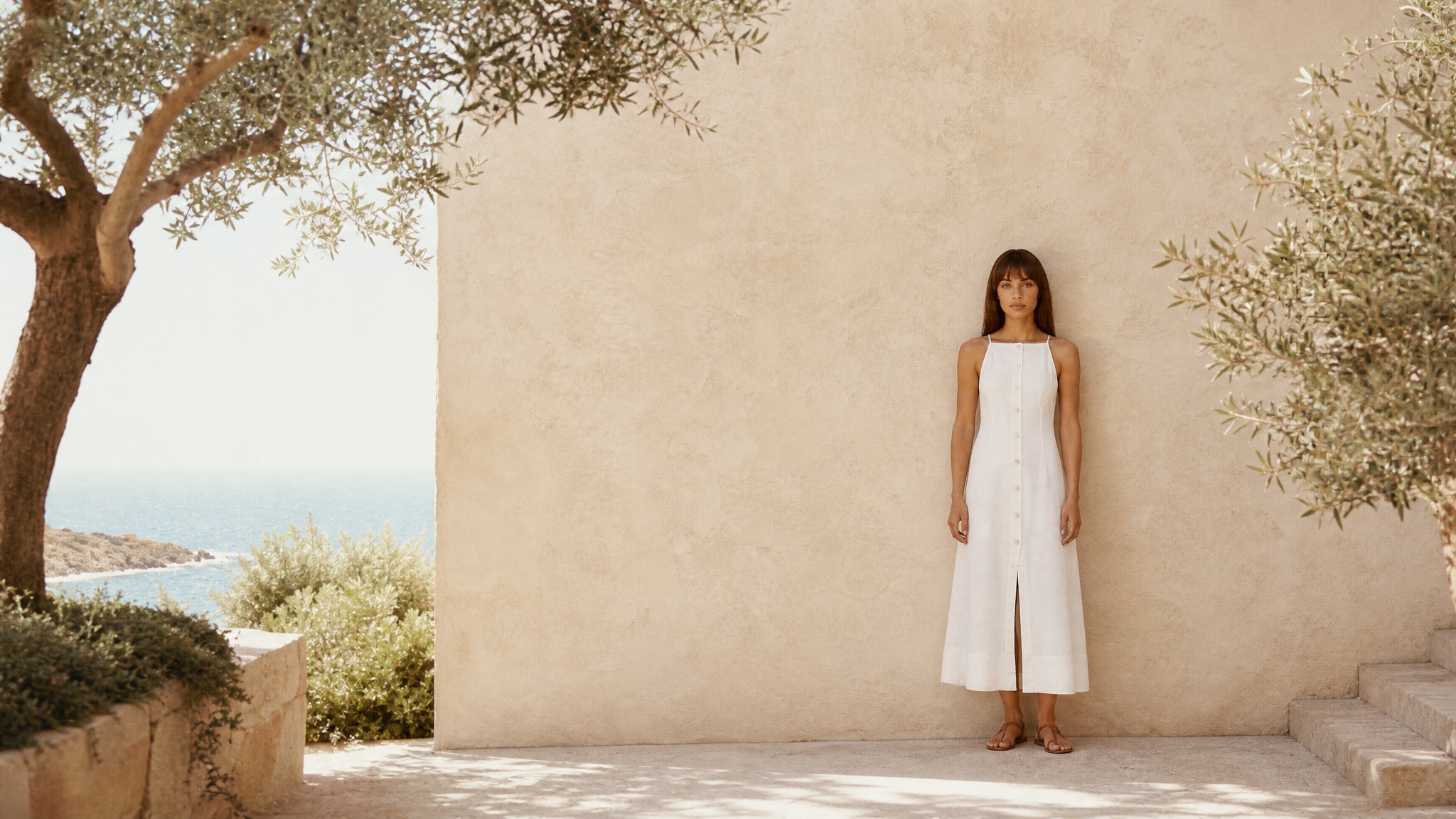
The fix is not a bigger moodboard. It is treating the identity as a positioning decision and a production system rather than a graphic-design deliverable. The brands that travelled out of Canada — Aritzia, Reigning Champ, Mackage — did not win on a better logo. They won on a visual system every surface composed against, locked early, applied with discipline. That system is what this page is about, and it is the same upstream layer the broader apparel brand identity practice is built on.

Why the small domestic market makes the identity a global decision.

The Canadian apparel market is small and concentrated. The country is roughly thirty-nine million people against the United States' three-hundred-thirty-five million, and the domestic premium-apparel customer base is a fraction of that again. A Canadian label that builds an identity calibrated to a Canadian customer — Canadian price expectations, Canadian retail context, Canadian seasonality — has built a ceiling into the brand on day one. The math of a small home market is unforgiving: to reach scale, the brand has to sell into the US and beyond, which means the identity has to read as world-class on the surfaces the global customer actually uses.

Those surfaces are not Canadian. They are the SSENSE PDP — itself a Montreal company that became a global retailer by building a world-class platform identity — the Net-a-Porter and Nordstrom grids, the US and UK Instagram feed, the Pinterest board a customer in Los Angeles is building. On every one of those surfaces, the Canadian label sits one thumbnail away from Reformation, Toteme, Frankie Shop and Aimé Leon Dore. The customer's eye does not grant a regional discount. A brand identity that looks great in a Toronto boutique and merely fine on the SSENSE grid has lost before the customer reads the price.

This is why building a fashion brand identity in Canada is, structurally, a global-bar exercise from the first decision. The positioning has to claim a price tier and a customer that exist globally. The visual system has to clear the bar set by the brands the customer is already scrolling past. The casting frame has to read as the brand's customer, not as a Canadian-market approximation of her. The founders who internalise this early build identities that travel. The ones who build Canada-first relaunch the look in year two — which is the most expensive mistake in the category, because the customer has already learned the smaller version.

Positioning, visual system, and the brand-spine document that ties them together.

A fashion brand identity that compounds is three layers locked together. The first is the strategic layer: positioning. Before a single colour is chosen, the brand has to claim a price tier, a customer, and an against-whom. "Premium but affordable" is not a position — it is the mush every undifferentiated label sits in. A real position sounds like "Canadian Reformation-tier contemporary womenswear at the one-forty-to-three-twenty price band, for the customer who shops Aritzia and aspires to Toteme." That sentence tells the visual system what to do. The deeper frameworks live in the apparel brand positioning work; the identity build starts where positioning lands.

The second is the visual layer: the system every surface composes against. This is the colour register in Pantone-locked sRGB held under three Delta E drift, the typography hierarchy, the light direction specified in physical terms — soft directional north-window, hard overhead, golden-hour back-light — the negative-space ratio, and the named environment language. Aritzia's identity is legible in this layer instantly: warm Mediterranean light, terracotta-and-cobalt environments, composed negative space, a specific kinetic-but-poised body language. None of that is the logo. All of it is the system. The logo sits inside it as one mark among many surfaces.

The third is the operating layer: the brand-spine document. This is the artefact most Canadian labels skip and the one that does all the work. The brand-spine document turns the positioning and the visual system into a one-page production contract a photographer, a wholesale-deck designer, a social manager and a paid-media editor can all compose against without re-deciding the look. It specifies the colour register, the light direction, the casting-frame identity, the negative-space ratio per surface, and the named environment list. It is the difference between a brand book that lives in a folder and an identity the whole production stack actually ships against. When this layer exists, the campaign, the lookbook and the feed read as one brand. When it does not, they read as three.

The five-week build from positioning to a shippable campaign spine.

The brand-world model ships a fashion brand identity in Canada in roughly five weeks — positioning, visual system, casting frame, brand-spine document, first campaign — against the four-to-nine-month agency path that quotes forty to one-hundred-fifty thousand for a brand book the brand then cannot afford to shoot. Click through the steps below.

Week 1 — Lock the positioning against a global shelf

We start where strategy lands, not where graphic design starts. The week-one session fixes the price tier in dollars, the customer in specifics, and the against-whom as named brands the customer already shops on the SSENSE and Net-a-Porter grids. The output is a one-paragraph position the visual system can be held accountable to — the sentence that ends "we are X-tier for the customer who shops Y and aspires to Z." Nothing visual is decided until this is signed.

What world-class looks like on the surfaces the customer actually uses.

The test of a fashion brand identity in Canada is not whether it looks good in the brand book. It is whether it holds on the SSENSE PDP next to Toteme, on the Instagram grid next to Reformation, and in the wholesale deck the Holt Renfrew or Simons buyer flips through next to twenty other lines. Those are three different surfaces with three different jobs, and a real identity holds across all three without being re-decided for each. The campaign hero earns the save on the feed. The studio lookbook frame reads garment-accurate on the PDP. The editorial frame carries the wholesale deck. Same colour register, same light, same casting frame, three surfaces.

Aritzia is the Canadian reference case because it did this at national scale from Vancouver. The identity is so disciplined that a single frame — the warm light, the composed body language, the specific environment language — reads as Aritzia before the logo loads. Reigning Champ did it in menswear: a restrained, made-in-Canada-quality visual system that travels to a Tokyo or New York stockist without translation. Mackage and Sentaler did it in outerwear at the luxury tier. None of these brands has a more memorable logo than their competitors. All of them have a more disciplined system. That discipline is the entire game, and it is what the brand-spine document encodes.

For a founder building from outside the Toronto agency ecosystem, the encouraging part is that the bar is location-independent. The brand-spine document is composed digitally, the casting frame is captured against it, and the campaign is composed against the spine without a location scout or a studio booking. A Calgary or Halifax founder builds against the same global bar a Toronto founder does, without the overhead. The identity layer feeds directly into launching the brand in Canada — the identity is the spine the launch campaign, the wholesale deck and the first season's feed all compose against.

The agency path, the freelancer path, and the brand-world spine, costed.

The traditional Toronto or Vancouver branding-agency engagement for an apparel identity quotes between forty and one-hundred-fifty thousand dollars and runs four to nine months — strategy, logo, typography, a brand book, a guidelines PDF. What it does not include is the photography that makes the identity legible. The brand book documents the rules; it does not produce the campaign hero, the lookbook or the feed that prove the brand to a customer. That gets quoted separately, and a launch campaign at the Canadian premium tier runs eighty to two-hundred-twenty thousand all-in. The founder who goes this route spends a year and a six-figure sum and still does not have the imagery the Shopify store needs in six weeks.

The freelancer path costs less and breaks more. A Fiverr logo, a freelance photographer for a half-day, a designer for the deck — each working from a different brief, none composing against a shared spine. The cash outlay is two to eight thousand. The cost is the three-brands problem: a store, a grid and a deck that do not read as one label, which the customer registers as amateurism the moment she lands on the second surface. The brand spends its scarcest year of attention training the customer on an incoherent identity, then pays the agency to fix it in year two.

The brand-world studio model closes the gap by building the identity as a production-ready spine and shipping the first campaign against it inside one engagement — the system and the imagery that proves it produced together, not handed between an agency and a photographer who never spoke. The five-week build delivers the positioning, the visual system, the casting frame, the brand-spine document and the first campaign at a fraction of the agency-plus-campaign combined cost. The full creative relationship beyond the identity build runs through the apparel creative agency in Canada practice — campaigns, lookbooks and feed on the same spine the identity established.

Fashion brand identity in Canada · frequent questions

What does a fashion brand identity in Canada actually consist of?

A fashion brand identity in Canada consists of three layers that have to lock together. The strategic layer is the positioning — the price tier, the customer, and the brands you are claiming the shelf against. The visual layer is the system every campaign signs against — the colour register in Pantone-locked sRGB, the typography, the light direction, the casting frame, the named environments, the negative-space ratio. The operating layer is the brand-spine document that turns the first two into something a photographer, a wholesale-deck designer and a social manager can all compose against without re-briefing the look every season. A logo is not a brand identity. The logo is one artefact the system outputs.

Why does building a fashion brand identity in Canada need to be global from day one?

Because the domestic market is small and the customer is already global. The Canadian apparel market is roughly a tenth the size of the US market, and a Canadian label that designs its identity for Canada alone has built a ceiling into it. The brands that have travelled — Aritzia from Vancouver, Reigning Champ, Frank And Oak, Mackage, Smythe, Sentaler — built identities that read as world-class on a Net-a-Porter grid, a SSENSE PDP and a US Instagram feed, not as regional brands. The identity has to clear the global bar on day one because that is the only feed the customer is scrolling. Building for Canada-first and globalising later means rebuilding the visual system once the brand has already trained its customer on the smaller version.

How long does it take to build a fashion brand identity in Canada?

On the brand-world model, roughly five weeks from positioning to a shippable campaign spine. Week one is positioning — price tier, customer, against-whom. Week two is the visual system — palette in Pantone-locked sRGB, typography, light direction, negative-space ratio. Week three is the casting frame and named environments. Week four is the brand-spine document that ties it together into a production contract. Week five is the first campaign shot against the spine. The traditional agency path runs four to nine months and quotes forty to one-hundred-fifty thousand for a brand book the brand then cannot afford to shoot against. The brand-world model ships the identity and the imagery that proves it inside the same cycle.

What does it cost to build a fashion brand identity in Canada versus hiring a Toronto branding agency?

A Toronto or Vancouver branding agency typically quotes forty to one-hundred-fifty thousand for a brand identity engagement — strategy, logo, typography, a brand book, and a guidelines PDF. That deliverable does not include the photography that makes the identity legible, which is then quoted separately at eighty to two-hundred-twenty thousand for a launch campaign. The brand-world studio model builds the identity as a production-ready spine and ships the first campaign against it inside one engagement, at a fraction of the combined cost — because the system and the imagery that proves it are produced together rather than handed between an agency and a photographer who never spoke.

Can a Canadian label build a world-class fashion brand identity from outside Toronto?

Yes, and increasingly the brands that travel are not from Toronto. Aritzia is Vancouver. Reigning Champ is Vancouver. The brand-world model is location-agnostic by design — the brand-spine document is composed digitally, the casting frame is captured against the document, and the campaign is composed against the spine without a location scout, a studio booking or a travel line. A founder in Calgary, Halifax, Montreal or Winnipeg builds the same identity a Toronto founder does, against the same global bar, without the Toronto agency overhead. The studio operates from Calgary and ships to brands across Canada and worldwide.

How is a brand identity different from a logo and a brand book?

A logo is a mark. A brand book is a PDF that documents the rules. A brand identity is the operating system that produces every customer-facing surface as the same brand — the campaign, the lookbook, the wholesale deck, the dot-com hero, the Instagram feed and the paid creative. Most Canadian labels have a logo and a brand book that lives in a folder nobody shoots against, which is why the feed reads as a different brand every season. The identity that compounds is the one captured as a brand-spine document the whole production stack composes against, so the brand reads as one world from the first campaign forward.

What does the casting frame have to do with brand identity?

The casting frame is the customer the brand is built for, captured as a locked model identity the imagery composes against. A Canadian label competing globally cannot afford a rotating cast of stock models that makes the feed read as a different brand every drop. The casting frame is locked in week three of the identity build — face, posture, body language, age register, styling logic — and every campaign and lifestyle frame for the season is composed against it. The customer recognises the brand before the wordmark loads. This is the layer most brand books omit entirely and the one that does the most work holding the identity together across a season.

Where does building a fashion brand identity sit relative to launching a brand in Canada?

Identity is the upstream layer. Launching a fashion brand in Canada is the full go-to-market path — manufacturing, market, funding context, first campaign and wholesale push. The brand identity is the spine that path is built on. You build the identity first because the launch campaign, the wholesale deck and the first season's feed all compose against it. Building the identity and launching the brand in the same cycle is the efficient path; building the launch around an identity that does not exist yet is why so many Canadian labels relaunch their look in year two.

Build the identity

Bring us the collection. We'll build the spine.

If you are a Canadian founder with a collection landing and an identity that is still a logo and a moodboard — send what you have. The positioning gets locked in week one, the visual system and casting frame in weeks two and three, the brand-spine document in week four, and the first campaign ships against it in week five — built to the global bar from Calgary, for a label competing worldwide. Questions before a call go to abhi@paperkites.co.

Book a brand-identity call