Why brands still run
static ads on Meta
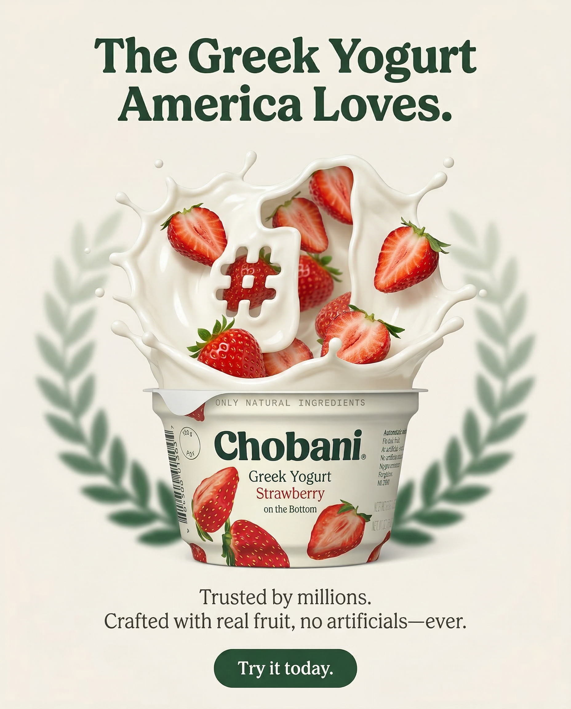
A static ad delivers its whole message in one glance, and a new angle only needs a new layout. That makes statics a cheap way to test ideas in Facebook and Instagram feeds.
Video gets a lot of attention on Meta, and static images still do jobs that video can't do as cheaply. A static loads as a single image, needs no sound, and shows the product, the headline and the offer at the same time.
That matters because feed attention is short. Meta's own research found people spend 1.7 seconds on average with a piece of mobile feed content (Facebook IQ, 2016). A well-built static communicates inside that window, before anyone decides whether to watch or read.
The economics favor volume. A video concept needs footage and an edit, while a static concept needs a layout, so testing several angles on the same product costs less. Meta's Advantage+ creative can also generate and enhance variations of single image ads once they are uploaded.
Static and video do different jobs. The side-by-side, including what AI video can do for product ads, is in static vs video ads.
What makes a strong
Meta static ad
Composition and Hierarchy
An effective static moves the eye from the hook to the product to the offer in a fixed order. The product is the hero, and the background exists to create contrast around it.
Put the headline where the eye lands first, usually near the top, and make sure the headline and the product image make the same point. In Stories and Reels, keep text and logos out of roughly the top 14%, the bottom 35% and 6% of each side, the areas Meta suggests leaving clear.
Category rules add a second layer on top of layout. A supplement or skincare static has to clear Meta's health claims review before composition even matters; see ad creative for health and wellness brands for what that changes about the copy and imagery.
CTA, Color, and Contrast
Meta shows the call-to-action button you choose with the ad, and the image itself still needs a cue toward the next step: a CTA shape, an arrow, a gaze or a contrasting color block. Use the same words in both places so the ad asks for one thing.
Color in the Meta feed works by context. Your ad sits between personal photos, memes and news, and the ads that get noticed create enough visual tension to interrupt the scroll while staying recognizably on-brand. High saturation suits some categories and muted palettes suit others; in every category, contrast with the posts around the ad is what gets it seen.
Our Meta ad
creative process
Every static we make for Meta starts from your brand's rules and the placement it will run in. Here is how an engagement runs.
Intake
A brand intake before production covers your visual language, model preferences, colorways and export specs, so every concept starts from your brand's rules.
Concept
We develop angles for your product and audience. Each concept carries one message, one proof point you can document and one call to action.
Production
Our team makes the product and lifestyle imagery with AI, without a physical shoot, and builds each size for its placement instead of cropping one file.
Delivery
Creative batches turn around in 48 hours, exported to the specs agreed at intake and ready to upload to Meta Ads Manager. Revisions come back within 48 hours.
Every Meta placement,
covered
Feed
Facebook and Instagram feeds. Meta recommends 4:5, and Instagram Feed accepts shapes from 1.91:1 to 4:5.
Stories
Full-screen vertical images on Facebook and Instagram Stories. Keep roughly the top 14% and bottom 35% clear of text.
Reels
Image ads in Instagram Reels, with the same full-screen shape and safe zones as Stories.
Carousel
Two to ten swipeable cards on Facebook Feed, each its own static, to show a range or build a case.
Specs from the Meta Ads Guide pages for Facebook Feed, Instagram Feed, Facebook Stories, Instagram Stories, Instagram Reels and carousel on Facebook Feed. Image files can be JPG or PNG up to 30MB. Checked September 2026. For TikTok and Google image specs, see our static ads guide.